
The Red Canary portal provides deep and useful information that goes well beyond the threats that we identify and protect you from. But until now, that information wasn’t exactly easy to find, interact with, and understand. So we gave the portal a well deserved facelift.
Let’s take a tour, starting with your homepage
You might remember seeing two major items on your previous version: The data graphic at the top of your screen—which we’ve affectionately dubbed “the waterfall”—and a timeline of Today’s Activity.
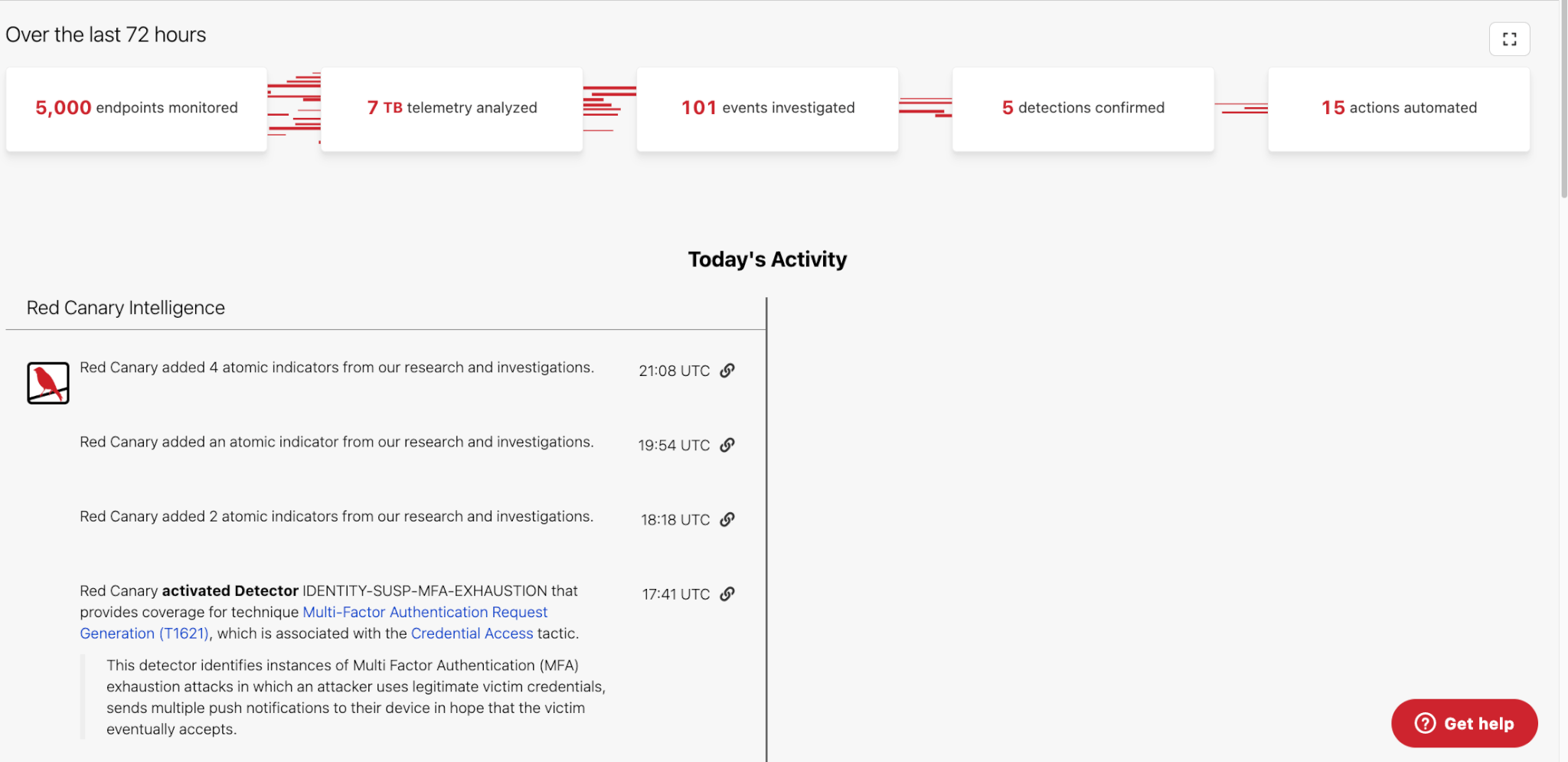
After looking at the data, we realized that our customers were spending very little time on this page, and that many were immediately clicking away from Home to get the information and resources they needed.
It was clear that your homepage needed to provide more value up front. So we went back to the drawing board. We sought customer feedback. And we asked our team—from product designers to engineers—to dream up a better experience for you.
Here’s what came out of those conversations and efforts.
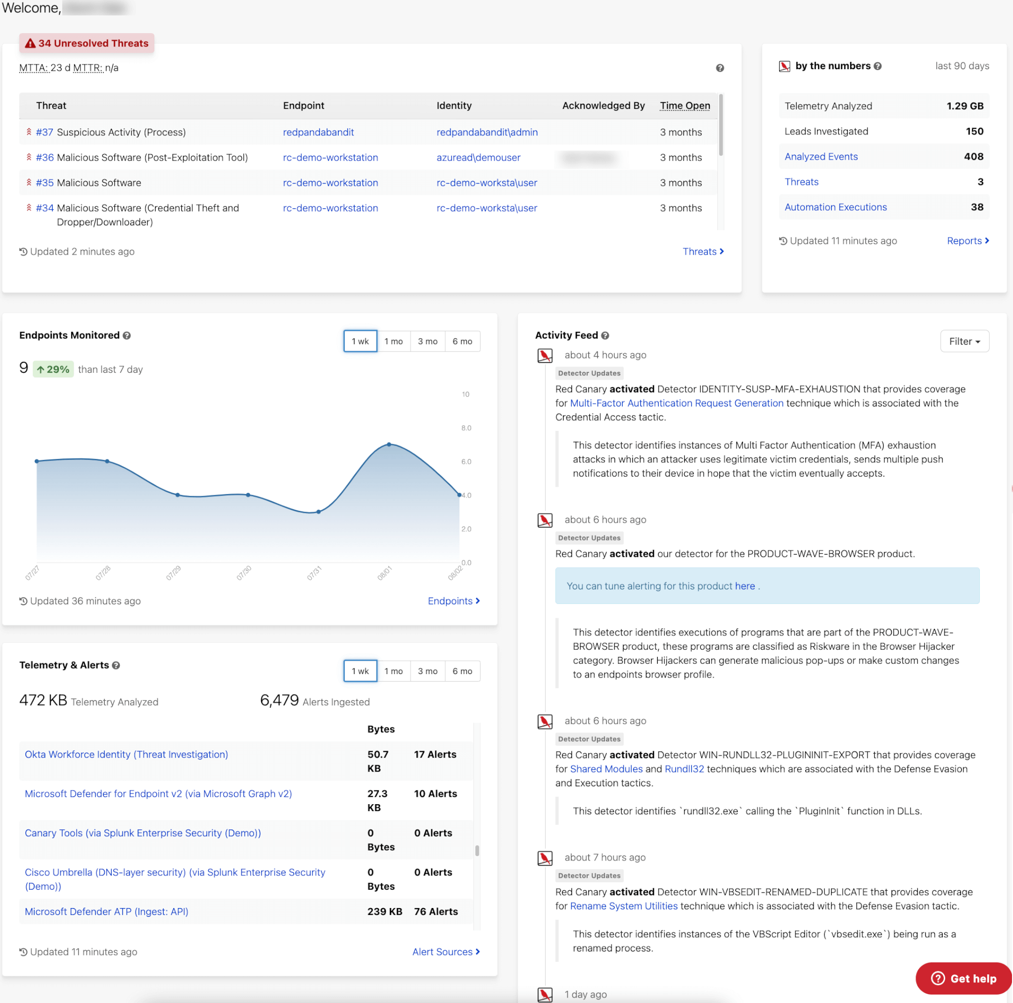
The first thing you’ll notice is that the page provides more detailed information across the different aspects of your environment.
No more unnecessary clicks. You’ll quickly be able to see any threats and their current status that may exist within your environment, detailed information about the endpoints we are monitoring, and the exact telemetry we’re analyzing across a filterable timeline. All in one place.
Yes, we went chasing waterfalls
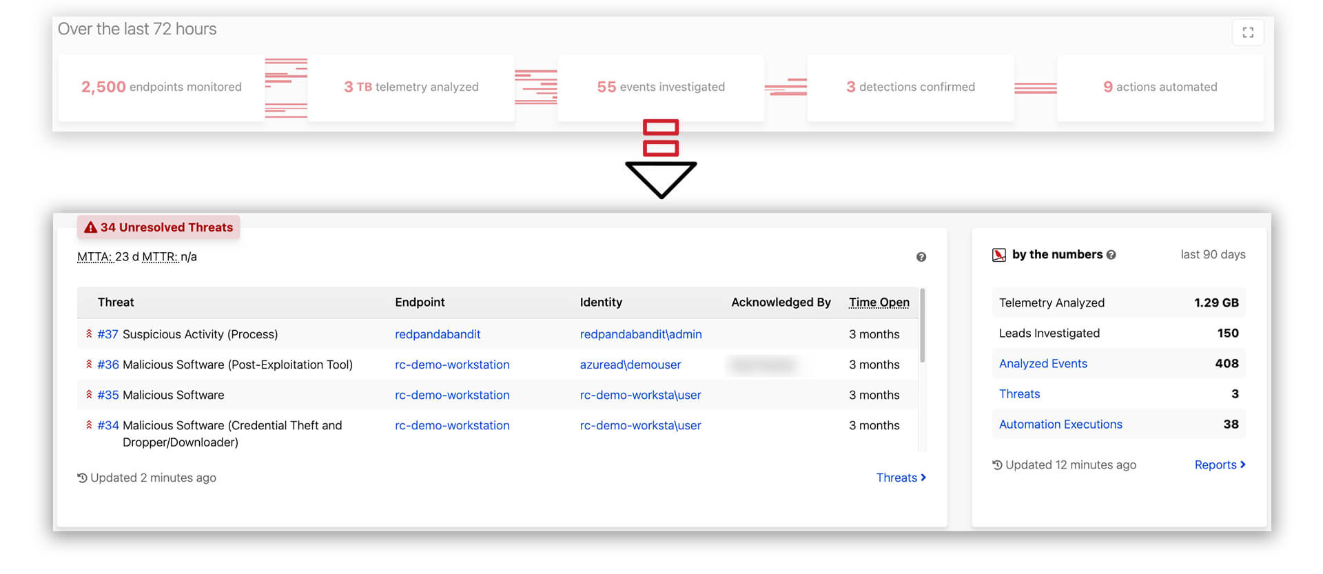
We loved the homepage’s “waterfall” graphic for so many reasons, but we ultimately decided to deconstruct it and make each section more interactive. We wanted to give you the ability to click and expand on each of the data points to see detailed and actionable information.
In place of that graphic, you’ll now see a detailed table showing you the exact threats in your environment, including the endpoints being affected and their current status. This means you can take action faster upon login. The waterfall itself is still present in the “By the numbers” widget, which shows you the flow of data down to the threats identified. You’ll also see that there are active links that take you directly to the page, endpoint, or threat.
Get the Canary’s eye view
Your new homepage also makes it easier to view the number of endpoints we’re monitoring in your environment, and even how that number has changed over time.
Just below that graph you’ll see a list of all telemetry and alert-level data, with the ability to click each one to view more information about that alert or datapoint.
![]()
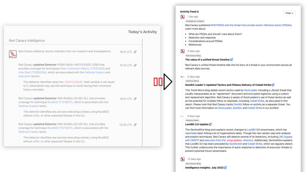
Today’s Activity just got a whole lot more interesting
Finally, the activity feed has been completely rehauled to include all security relevant data to our customers including threat updates and industry news, not just activity within their environment.
The bottom line: You can now filter what you want to see within your feed.
Now it’s your turn to take the wheel
We don’t believe in dropping a bunch of data on your doorstep and walking away. That’s not us. We want the time you spend inside the Red Canary portal to be worth it—so you can make better decisions, drill down into the places that matter, and get back to doing what you do best. What do you think of the homepage changes? Dive in and let us know what you think at info@redcanary.com.
Related Articles
Red Canary brings MDR expertise to Microsoft Azure Cloud
Red Canary brings MDR expertise to Microsoft Azure Cloud
Red Canary teams up with Wiz as its first certified MDR partner